Uncategorized

Kitchen Remodel

IMG_5912.jpgSo we have sold our home, and are getting ready to simplify and move to a single story rambler in Lakewood.  Its a bit smaller,  a lot simpler, and closer to our grandsons who are in Wheat Ridge.

IMG_4981.jpg

After living five years with a kitchen that had very modern cabinets that towered over me.  The countertops were 4 inches taller than standard.  The cabinets on the wall were an additional 4 inches higher than standard 18′ from the countertops that were already too tall.  I couldn’t reach much above the second shelf on the 44 inch tall wall cabinets.  The kitchen was uncomfortable, inefficient, out of step with the rest of the house, and completely cut off from the rest of the house.  It also had nothing interesting about the style which was basic grey.  The blue granite countertop I guess was pretty, but I’m not a big fan of granite countertops.  I also don’t love stainless steel appliances. I like warm, comfortable kitchens. I’m not a gourmet cook and I don’t need to use my kitchen to “entertain”  I like white appliances, which have become harder to find.

IMG_4994.jpg

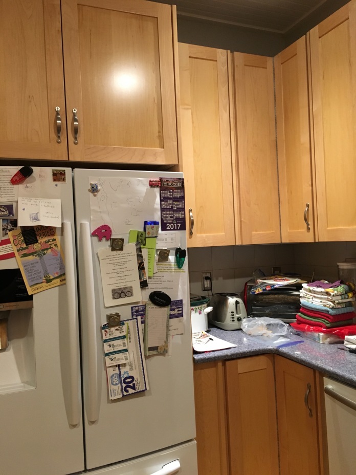
In the five years leading up to the remodel, we had replaced the Fridge.  It was stainless steel, and not a good fit for us, and the range, which just stopped working.  I’m pretty sure everything in the kitchen as we got it, was purchased because it was on sale/discontinued.

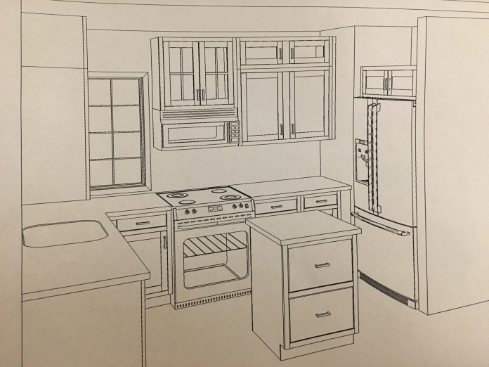
In May 2017, We finally began the kitchen remodel  We wanted to open up the kitchen to the rest of the house, but wanted to respect the historic Denver Square style.  We accompished this by opening the wall between the kitchen and the hall.  Before this, in order to enter the kitchen,  you had to walk through the dining room and go through the 24 inch doorway, or come in from the backyard.  We also widened that entry from the dining room to a roomy 36 inches.

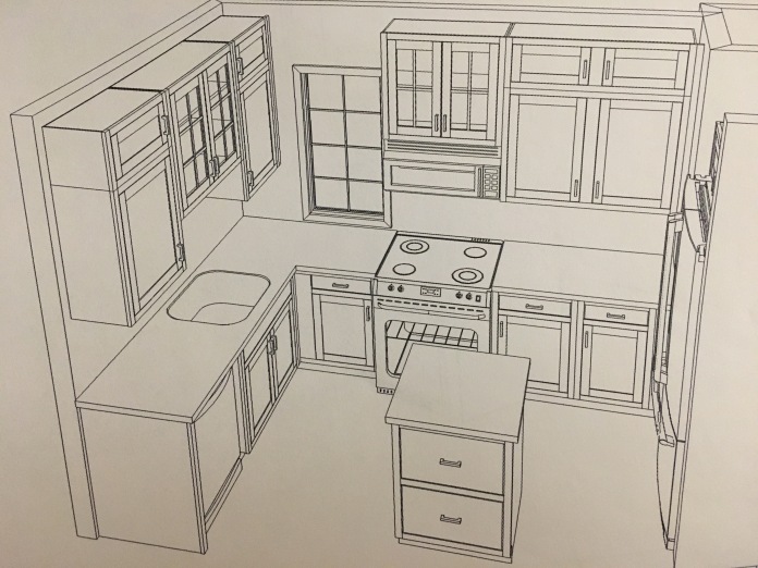
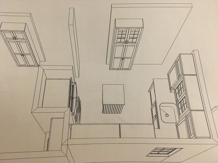
I wanted to honor the era that the house was built, but wanted to make it 21st century  functional.  I didn’t want to live in a museum.  Since the house was built in 1904 we kind of decided on a general early 20th century feel.  I knew the cabinets had to be white or close to white.   I scoured libraries and online, and finally settled on and referred to the book Bungalow Kitchens, using it for guidance.   We again hired Culligan Construction from Arvada to do this project.  And as usual, they did not disappoint.

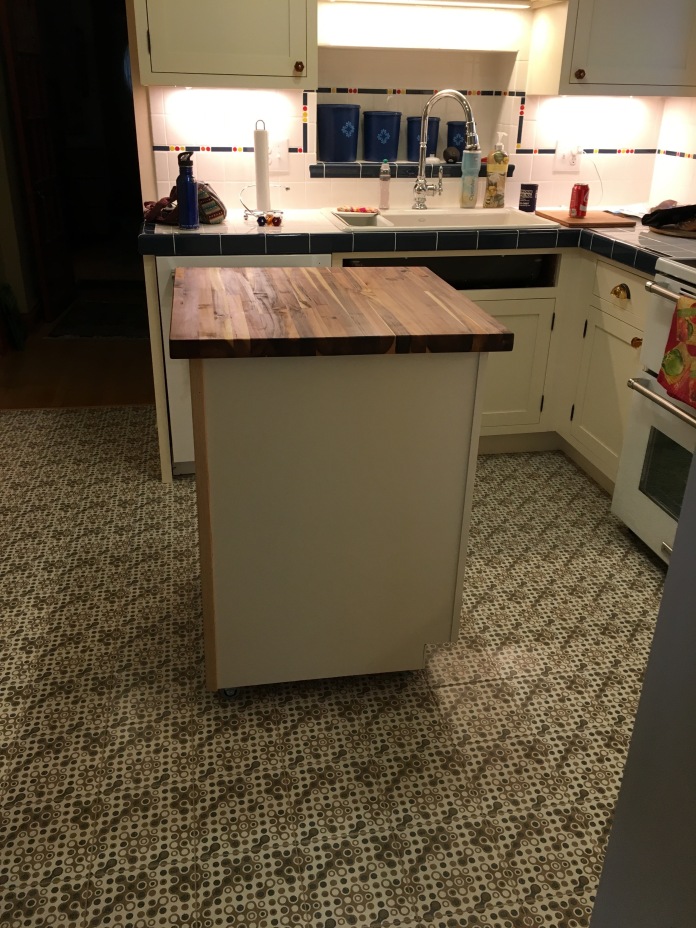
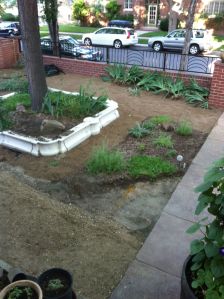
Working with a small footprint of 10’x10′ we had to maximize every inch.   We were going to lose the large pantry cabinet because of the fridge reloation.   It had to be relocated because it would be in the path from the hallway into the kitchen.  By removing the wall and shallow closet in the hallway, we also lost some cabinet and counter space. To compensate for that loss, we added two narrower pantry cabinets, one in the Laundry room, and one in the kitchen, and the mobile island with Acacia top more than compensated for the lost storage and counter space.

IMG_4880IMG_4879IMG_4878

IMG_5218.jpg

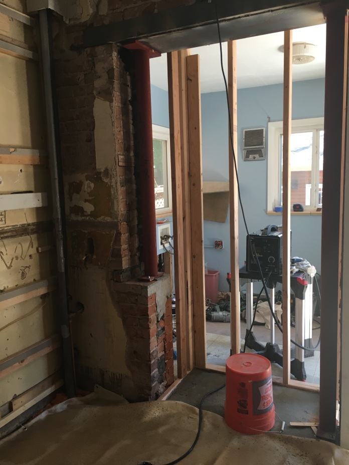
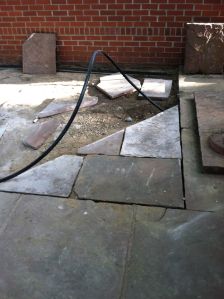
Removal of the brick wall between the Kitchen and Laundry room complete.  It was originally the exterior wall, with a window that had been removed and used for a cabinet in the laundry room.

IMG_5153.jpg

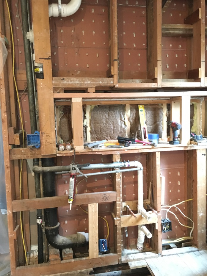
Everything was stripped down to plaster and lath, and studs. We removed part of the back wall and bumped it back into the Laundry room.  This alcove was the size of our fridge, in order to create  a tiny bit more floor space.

IMG_5232.jpg

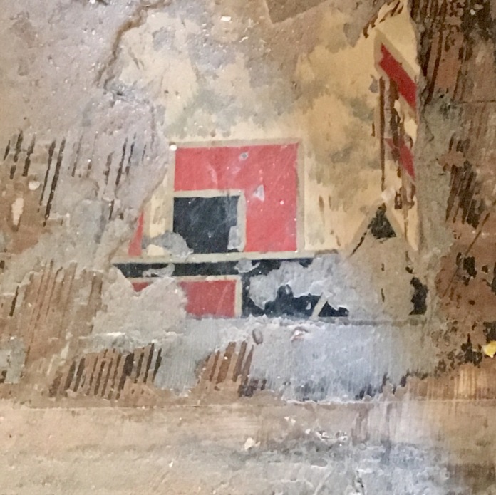
Cool old tile that was found under the floor.  Or maybe it was wallpaper, I can’t remember!

IMG_5915.jpg

I haunted every tile store in Denver in vain, for ceramic tile that was retro, but was unable to find what this kitchen needed.  I found this fantastic pattern on Wayfair.com.  It feels like a floral, but when you look closer its more abstract.  Calico amoeba, I call it.   I was worried about buying it online without having seen it, but it really turned out to be perfect.  Unlike anything I’d seen in modern tile stores.

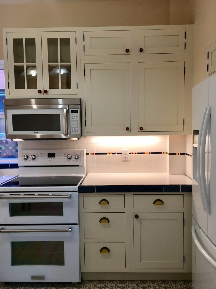
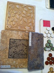
I did not want granite countertops, I wanted ceramic tile.  My contractor tried to discourage this choice.  I prevailed, and found a white 4 inch square tile, with tiny copper specs in it.  I also yearned for the tiny ceramic pinstripe in the backsplash I had seen in most vintage kitchens.  This  is virtually unavailable today.  I found some on ebay, but what if there weren’t enough??? Everything I saw was thick, textured, and not what I wanted.   Between the contractor and myself, we improvised a pinstripe  pattern by using penny round tile samples to add a little color, and thin 1/4″ x 9″  tiles cut in random lengths.  It matched the blue tile in the countertop edges, and the blue in the floor tile pattern.   The result is completely original and I love it!

We replaced the small D shaped stainless steel sink with a large farmhouse style white porcelain sink that is wonderful.  I’m able to wash even the largest pans & cookie sheets in that sink.

I wanted retro drawer pulls, and cabinet knobs. But nothing that looked like what I had seen before.  I found the amber glass knobs at House of Antique Hardware online.  The fantastic amber glass drawer pulls I found at Denver Hardware.

My upcoming move to Lakewood is pressing on my mind, so I need to close up this entry.  I really am happy with how our retro/historical kitchen came out.  I will miss it when I switch over the the Mid-Century Modern style of our new home.


Standard
Uncategorized

luna 2

Chalk Festival 2014 greeted me with more than the usual amount of nerves. I learned on Thursday morning before the festival that they had not received my application that I sent in on March 15. I talked to Michael Reiger, the director of the festival, and he said to show up Saturday morning at 8:00. They usually have a few empty squares and no-shows, and will give them to whoever shows up first.

This year I was more prepared than I was in any previous year.  I had chosen Luna by Pre-Rafaelite Charles Edward Halle. This is the color pencil drawing that I thought I sent in with my applicatioon.

Scan 140740001

I had gridded the picture, and made a large (18×24) pencil drawing a couple of weeks before. I had spent Tuesday that week getting ready, buying extra colors of large pastel sticks I needed for Luna. I  found some clear square pencil boxes to divide up my colors at Office Max on clearance two for a dollar. On Thursday when I got the news that my application was never recieved, I kind of went into a funk. I thought it would be an easier weekend not participating. I would get some needed rest. I could hang out with Felix. I wouldn’t be sore and recovering for several days.

But the more I tried to talk myself into it being ok, the more anxious I got. I added some pastel to the pencil drawing I had done previously.

IMG_4896i

I hated it, and thought that maybe I should do a different image. One that I knew and felt good about.  I thought about Woman With a Pearl, by Jean-Baptiste Camille Corot, and at midnight Thursday night, I scanned from the book I have it in, and prepared to go to Office Depot the next day and print it, laminate it, and put a grid on it.

Scan 141490004-1 - Version 3     IMG_4948

I knew this other image very well, and was sure would be able to easily transfer it to pavement. I had done it a few years ago, when I first saw the Chalk Art Festival in Denver, and thought I would like to participate. I had worked for a couple of weeks perfecting it and liked it very much. Though my copy is a bit pale, I could correct it when I got it onto the street.  But, I still felt anxious, and nauseous and couldn’t sleep. I had lots of chalk in oranges, reds, yellows for Luna, and not so many in the browns and greens that Lady with a Pearl has. My stomach turned, and I couldn’t get the song “Richie and Reuben” by Fountains of Wayne out of my brain. I had heard it earlier in the week, and it had become an ear worm.

It seems that changing course had made me feel worse, so I decided to go back to the original plan, square or no square. I also decided that on Friday I would take Phoebe to Playful Pooch for the day, so I could concentrate the whole day perfecting Luna without puppy interruptions.  I spent Friday working on the drawing, and gathering up all of my needed materials. I was ready to go, square or no square on Saturday morning at 7:30.

Howard and I arrived, ready to go, at 8:00, Found Michael, and he said that it might be a couple of hours before he would know if I had a spot. I was about ready to just say, forget it, and go home. But we had bought breakfast on the way, so we sat and ate our breakfast. We walked a bit, watching artists and vendors setting up. We walked over to The Market on Larimer St, so Howard could get some coffee. I decided to continue looking around. As I walked out of the Market, I saw Michael. He pointed at me and said “Paris, I have a square for you, follow me!” I was giddy, and rushed after him. He took me to the Artists tent and gave me square F-18, and the sponsor’s name Kurowski Development. The wait was thirty minutes, not two hours. Howard walked up to the artist tent as I was leaving with my packet of goodies. Relieved and happy, we were in!

We got to the square, on 14th st near the intersection with Lawerence, and got busy measuring and drawing the grid.  This is my least favorite part, but extremely important if you want a good drawing. Howard got started printing the sponsor’s name above my square, which is also pretty important, since they shell out $300 to have their name above a square. It is should to be the first thing we put down in chalk. He looked up the company, and tried to approximate their logo. He is better with printing than I am, and I was anxious to get drawing. About an hour later, a guy came up to us and said, “you’re in my square” I assured him that I was definitely just given that square. Hopefully he got another one, or just had the wrong number. I did not see him again.

I carefully transferred the image to the grid, and started on the background.

photo (3)

Eleven hours and several kind visitors later, I had the entire head and shoulders of Luna finished. I went home sore and extremely tired, but happy. Had a late dinner and went to bed early.

This is what I got done on Saturday:

IMG_4913

Sunday morning, I headed back at 8:00 and picked up where I left off. Sunday is a shorter day. I worked in shade and very hot sun till about 2:30 when I finished. Judging starts at 3:00. Lots more friends visited Sunday afternoon, and I felt pretty special and loved.

IMG_4940

I’m happy with the results. I couldn’t have done it without Howard, and his quiet patience and support. He was great, getting stuff for me, helping drag all of my stuff downtown. Finding parking so I could work, and generally being great.

IMG_4942

Thanks to all who came by.  Including:

Roxanne Des and Felix Barker

Debra Rathbun

Lyssa, Peter, Katie, Peter & Thomas Krumholz and visiting family members from out of town here for Katie’s graduation

Pat Moore

Sister Mckenzie and Sister Liao

Larry and Roberta Valdez and their granddaughter Caitlin

Margo Waite & her kids, Jessica, Emily & Maxwell Jaynes

Janet Zamboni

Rhoda Levy

Erin & Eric Worth & kids

Marisha, Taylor Brynley and Mason Menlove & their neighbors

Bonnie Mustoe

Candace and Matt Jones and their baby

And those who came by when I was away from my square:

Terri & Isabel Grange

Carol Bellinger

And all who watched from afar on Facebook

See more pics of the festival here:  http://www.denverchalkart.org/ It usually takes a couple of weeks before the pics are on the website. But I have included some on my FB page https://www.facebook.com/heathermcleanparis

Here is also a video of stills:  My work shows up around 3:34. http://youtu.be/j50uR6zi5Q8

And here is another:  This is actually a video I’m at 10:13 http://youtu.be/DY_oib-flv0

And another one  – this one is short. 

Link
Uncategorized

Theme and appearance change

This blog started out as a place for me to gather all of the information about the remodeling of our house.  We haven’t had anything done for almost a year, so it’s been a bit quiet on the blog.  I have decided to change the theme of my blog.  This will be my place to record important stuff that I want to remember, so I am totally fine if you decide that it isn’t worth your time.

There is nothing earth shattering, but there were some very important changes in my life including this guy coming into it last May.

   IMG_4957

And this little critter coming into our lives in January of this year

IMG_4560

Much of my life revolves around these two.  Felix is now one year old, and Phoebe is eight months old.  They are both interested in each other.  Felix likes Phoebe, but she kind of freaks him out if she barks too loudly or runs up and surprises him.  Phoebe just loves everybody.  She doesn’t quite know her own strength, and needs to get a little older and Felix needs to get a little older and then they should be pretty good buddies.

Standard
Uncategorized

Denver Houses

When I first started looking at houses in Denver, I was so impressed with the variety of the architecture here.  And, coming from Virginia, where even the new houses are built in colonial style, I was wowed by the stunning lack of colonial style homes.  Denver wasn’t developed much till after the mid- 1800s, well past the colonial period.   I started reading all I could get my hands on about the styles of homes in Denver.  I saw a quote in a book, which  I can’t remember the name of.  It was by a circa 1904 reporter from Chicago, or another city, commenting on the beauty of Denver’s private homes, and public schools.  Driving around, I would stop in front of houses just to take pictures of them.  Here is a sampling.  I apologize for the small photos, most of these were taken with my pre-iPhone phone camera:

This storybook style house is on busy Colorado Boulevard.  I wish it was on a quieter street, and was for sale.  photo (1)

La Rue, one of the many charming early 20th century apartment buildings with a name.

0402091302

Two story, one story and one and a half story Victorians

0403091321

Mid Century Modern, not a ton of them, but enough to be fun.

0508091753

Meet Me in St. Louis, Louie?

0616091231

Creative paint colors on this brick Victorian

1025081108

Queen Anne style victorian – shades of  Tim Burton

1104091548a

 Bungalow with Tudor influence

KONICA MINOLTA DIGITAL CAMERA

Another mid-mod

KONICA MINOLTA DIGITAL CAMERA

And another

KONICA MINOLTA DIGITAL CAMERA

Some more cute apartment buildings -Rene

I love the geometry,  circle and triangle shaped shrubs in front of this balanced mass of shapes.

0305091228

The middle eastern influenced – The Carolyn

0321091114

I can’t remember this one’s name, but it’s foyer windows look like the Empire State Building at night.

0429092115

Many of Denver’s houses are brick, on account of it’s fireproof, and it’s kind of dry here.  Sometimes they have fun and games with brickwork.

KONICA MINOLTA DIGITAL CAMERA

KONICA MINOLTA DIGITAL CAMERA

KONICA MINOLTA DIGITAL CAMERA

[insert photo of Calico house}

Even modest houses are little works of art

KONICA MINOLTA DIGITAL CAMERA

And people aren’t afraid to paint their houses purple

0718091323


Now to the house we ended up buying in 2011.

SAM_1988.JPG

It’s not really Arts & Crafts style, though it has many details that lean in that direction.  It is basically an American Foursquare, known in Denver as a Denver Square, with some Arts & Crafts influence (the windows, the built in hutch), and a bit of colonial revival details (columns on the front porch).

Standard
After, Bathrooms, Before

Upstairs part 3 – Master Suite

It has been several weeks since I posted.  I have had several house guests throughout September and October, and haven’t spent much time here on the blog.   So, as a refresher, here are photos of the weird bathroom remodel that was in our house when we bought it.

sink  showerbathroomconnector

Ever since my kids were little, I dreamed of a laundry room on the bedroom level.  That is where ninety-five percent of the dirty laundry is generated.  With a laundry room on the bedroom level, traipsing up and down two flights of stairs with baskets of laundry is a thing of the past.  So our first design for the Master Suite included a walk-in closet, and a laundry room, built over the existing laundry room, which is adjacent to he kitchen.   I really liked this design, but the more I thought about it,  I decided that the sound of the washer and dryer while trying to sleep, isn’t super appealing (especially the spin cycle!).  Also, house guests would have to schlep their laundry through our bedroom, not good.   And, it would cost a lot more to build out over the balcony, including walls insulation, and roof, plumbing, electric, etc.  So we went with plan B, and decided to keep the laundry room where it is, on the main floor, next to the kitchen.

Plan B looks like this.  It also includes, not shown, putting a new roof on, and adding deck flooring and railing over the old, slanting roof , that was pretending to be a balcony.  Thus making it a usable balcony, accessible through the existing door.

upstairsbath    revised floor plan

This plan takes a minimally usable extension to the main bath, and makes a very nice master bath, with two sinks, a toilet, a tub and a shower.  A complete separate room from the hall bath.

The existing shower and sink (the only fixtures that were in this room) were removed, and the closet (the original one from when the room was a bedroom) was cut down to half its  size.   In moving the shower to the opposite corner of the room, we uncovered a window, which we replaced with glass block.  This allows light to come into the bathroom, but the bathtub next to the window has privacy.

The tub is a Kohler bubble tub, not a whirlpool.  There are tiny holes in the sides, near the bottom, where warm air is shot into the water, creating the massage effect.   There are no jets to clean, no worries about mildew or sediment build up.   It also has chromatherapy,  led lights that change color.  It is a lovely wide rectangle, very modern looking. The space available was wide but not long, but the tub is very spacious, and I use it almost every day.

This vanity light bar unfortunately doesn’t photograph well when lit.  Maybe I’ll try to photograph it in the daytime with the door open to allow outside light inside.

This room allowed me to put to use all of the design ideas and wishes I have had for the past 20 years or so, but haven’t had the funds to realize until now.  I wanted cork flooring, and so we have that.  I love glass block, and we not only put it in the existing window opening, but also put the little partition wall between the toilet and vanity cabinet.  The cabinet, by the way, is not from Ikea, because they didn’t have a size that would work in this space.  We had this custom-made, and I absolutely love it.   I wanted this bathroom to be a very quiet restful room.  The cork flooring is amazing.  It is quiet, and warm, the polar opposite of a ceramic tile floor.   Simplicity and clean lines are the main design features.  And since this room is accessable only through the master bedroom (via pocket door) it doesn’t need to look historically accurate.   That’s my story and I’m sticking with it.  Living in a historic home should not be museum like, it should be usable for the 21st century, and pay respect to the original build.  Plus I have my historical bathroom in the hall bath.

We found some nice porcelain ceramic tiles in neutral greys with black and white.  Dennis from Culligan Construction in Arvada, Colorado helped me with the design surrounding the bathtub, shower and vanity backsplash.  The large tiles are 12×12 inch, mostly white.  The tiles in the shower and surrounding the tub are the same color, but appear different in the photos because of the lighting.  If I were a better photographer, I would know how to and have more motivation to fix this, but . . .   Another interesting tidbit about this bathroom that I finished 10 months ago —  Last weekend I went to an open house with Roxanne.  This was a very modern new house built on a city lot in an older neighborhood.   The very modern, brand new house had the exact same tiles in the bathroom.  Different configurations, but the same product, nonetheless.  And my vanity light was also in the powder room in that house.   This just proves how cool I really am.

tub .shower mastersinks  IMG_3046 IMG_3047  IMG_3043  IMG_2280 IMG_2287

Standard
After, Bathrooms

Upstairs part 2 – Hall bathroom

The plan below, takes one weird, poorly planned bathroom, and creates two separate bathrooms, with two very different identities.  A full bath in the hall for guests (or children of future owners), and master bedroom/ bathroom suite and balcony (with railings).  The hall bath is the lower part of the second drawing.

As we found it

As we found it

This is the revised floor plan for the bathrooms

What we did with it

Stylewise, I wanted the hall bathroom to be close historically to the time the house was built in 1904.   I found a great book  Bungalow Bathrooms, which became my bible for the design of that room.  It is a great history of bathrooms and plumbing, which sounds completely weird, but it is entertaining, and informative.

So, I came up with a general early 20th century style, leaning toward the 1930s.  I found these light fixtures from Rejuvenation.com.

lights

I love that they are porcelain,  not plastic, with cool white glass skyscraper shades.  Very Art Deco.  So Art Deco became the theme.  No bathroom vanity, but a pedestal sink.  A strong color for the walls,  small hexagonal tiles for the floor.  Vintage inspired medicine cabinet.   I wanted subway tile on the walls,  but something more interesting than plain white throughout the room.    I had seen some very cool little border tiles with fish or flowers or geometric designs in the book, but found very few in modern tile stores.  We came up with a black beaded border pencil tile, and a top chair rail style tile in black to finish off the tile wainscot.

halltile

I forgot to mention what we did with the reclaimed window.

before

 I didn’t want a clear window in the shower, duh!   I thought stained glass  would be cool.  I found an artist on Etsy in Grand Junction Colorado.  I liked a lot of their designs, and was able to have them custom make one for my bathroom.  I wanted the window to be functional.  So it became a fixed stained glass panel for the bottom two-thirds of the space, and a functional hinged window in the top third.  Building code dictates that windows in a bathroom renovation need to be tempered glass, so the stained glass was sandwiched between two pieces of tempered glass.  Here is the finished result.

stainedglass

Unfortunately the photo doesn’t do it justice.  It is just gorgeous.  There is a lovely rosey purple color in the moon, that I picked out for the walls.

The floor needed something other than white hexagon tiles.  I saw lots of designs and decided I wanted a  border design in black with random black hexagons throughout.  Almost like there was a rug there.  Here is what it ended up looking like.

hallfloor

Here is a close up showing the hex and square tiles used in the floor

floor

We had space leftover at the end of the tub, where my contractor built a shelf / bench and some recessed boxes for shampoo and stuff.

shelf

So – with the stained glass window, the pedestal sink, the black toilet seat and lid, the subway wall  tile and hex floor tile, my lovely art deco style bathroom took shape, and I couldn’t be happier with the result.

The finishing touch – we installed a cute little original light fixture on the ceiling, that was hanging in one of the bedrooms.

vintagelight

Here is a list of what we did:

  • Closed  the opening to other room, and installed a vintage looking, new  pedestal sink creating a complete bathroom
  • Removed the ceiling lowering arch above the tub, and uninspiring wall and floor tiles
  • Replaced the old shallow painted bathtub with a beautiful, deep, Kohler cast iron porcelain tub with nice period  details
  • Replaced the toilet with a newer, nicer, more efficient one that matches the style
  • Installed subway tile with black pencil  border and top cap to enhance the art deco look
  • Uncovered the window, allowing natural light and fresh Colorado air to come into the room
  • Created a lovely tile rug design on the floor.  The tile, I learned, is made by the same company that has made it for over 100 years.
Standard
Before

Upstairs – Part 1

I decided that this project deserves more than one post, because there were so many things wrong that needed fixing.

Here is my free hand, not really to scale, drawing of the upstairs when we bought the house.  I’m including this drawing, because we made changes in every room except bedroom #3 in the front of the house.

upstairsplan

And here is a detail of the bathroom, which was really more like two partial bathrooms.  One room had a tub and a toilet.  The other had a shower and a single sink.  The sink and shower room had been a fourth bedroom and the original closet was left untouched.

upstairsbath

There was a doorway sized opening between the two areas.  Which I suppose was an attempt to make it look like one large bathroom, which it didn’t.  There were far too many doorways breaking up the space, and lots of wasted space.   Both rooms, we discovered after moving in, had windows, which had been walled over.  The tub & toilet room had a, dim, flicker-y flourescent light.  There was some natural light from the door that goes out to the balcony from the sink & shower room.

 Here is the toilet & tub half of the bathroom, as we found it.

Tub       toilet

And here is the sink & shower half of the room.

door&trim        shower

sink       bathroomconnector

With such minimal fixtures, it is amazing how many things are wrong with this. We decided that the previous remodeler, didn’t know how to mitre a corner.  As illustrated by the corner plinths on the crown, and wainscot, the medallions in the corners of the door trim (and in the middle, just for good measure!)    No attempt was made to match the trim to the existing trim around the door to the outside, or around the door to the hall.   The bead board panelling goes up to the ceiling in places, but there is still a chair rail hight wood trim attached to it.  WTH???  Two little glass shelves were glued to the mirror, above the lone sink, and after a couple of months of using them, they came unglued.  The lights in the sink & shower area were bright, glaring CFLs, impossible for makeup application.  The bathtub was shallow and had been painted white, which I didn’t realize, untill I tried to use it.  The arched ceiling above the tub was a usless waste of a beautiful high ceiling.  There was a 15 inch wide wall added to fill in the space between the end of the crappy, cramped, painted tub and the wall.    The shower was huge, and very nice, but everything else was awful.  These rooms made me want to scream.

Because this depressing mess of a remodel felt like two separate rooms, we decided that we would create two separate and beautiful bathrooms.

Standard
Bathrooms

Powder room

When buying a home that has living space on three levels, it is nice to have a bathroom on each level.  This was the one on the main floor.

IMG_0685

This room is tiny.  The wall color of choice for all of the bathrooms in the house was of course Williamsburg blue.  Don’t ask me why, it was probably on sale.  In this room it was high gloss, and heavily textured.  Below the blue walls, the wainscoting that looks like wallpaper is, unfortunately, panelling.  It looked like this:

SAM_1197SAM_1196

The trim around this charming paneling  was the fakest plastic wood ever created.  The vanity cabinet was just odd (let’s not make a corner cabinet, lets take it to the next corner for all that extra storage we’ll need, who cares what it looks like?)  The light was bottom of the line hardware store stock.  I called this room the “gas station”  because it reminded me of a gas station bathroom from the 1970s.    I would leave the light off while in there  to minimize the assault on my eyeballs.

IMG_0338

I knew that this powder room and the other bathrooms in the house would need re-doing.  So I started haunting tile stores, kitchen and bath showrooms, and home improvement stores.  I took home tile and paint samples.  I looked at Architectural Digest, and Old House Journal, and Colorado Homes  for ideas.  Online I found Bradbury and Bradbury, a company that specializes in historical wallpapers and fell in love.  I ordered a bunch of wallpaper samples from them.

Here are some of wallpaper and tile samples I collected.

samples   IMG_0688IMG_0687

Obviously I wanted something botanical, soothing, cool, and un-gas station-like.   I had lots of ideas, but knew no one that I could trust to make the transformation.  I had done some minor remodeling projects in the past, replaced light fixtures, toilets, hung wallpaper, installed new flooring, and painted many, many walls and ceilings. That was a while ago, I’m older,  and I wanted someone with specific expertise in this area.   I needed someone to keep me from going overboard, which, as a creative person, I tend to do.

On one of my trips to Broadway Tile in Denver, I  heard a customer talking with the owner about a project he was working on.  The customer  seemed aware of aesthetics, and not just the nuts and bolts of remodeling.  After eavesdropping for a few minutes,  I asked him if he was a contractor.  He turned out to Dennis Culligan, owner of Culligan Construction in Arvada, Colorado.  (I found out later that he is also an artist)

Dennis and his head project guy, Jim, came over to see the house.   They both were very chatty, and we spent about two hours looking at, and laughing at all the weird stuff that had been done to this house.  They seemed genuinely interested in working on a vintage home and not just anxious to make a lot of money.   I was still nervous about jumping into a huge remodeling project, which the upstairs project would be.  So Howard and I decided that we would have Culligan do the powder room.  If we liked how it came out,  we would talk about the upstairs.

Here is a photo of some cute Japanese inspired wallpaper, found during demolition, hiding under the blue walls.  I love it.

IMG_0675

The cabinet door knobs came from a box of stuff from my parents house.  Not sure where they were originally, but I was happy to put them to use.

IMG_0860

I found this doorknob in a drawer in the dining room hutch. Happily, it works as beautifully as it looks.

IMG_0859

 Lovely lights from Justice Lighting

IMG_0858

Mossy green penny round ceramic tile on the floor.  I love the look of these,

IMG_0854

actually liked them so much that we included them in the vanity countertop.

 IMG_0805

Bradbury & Bradbury’s Idylwild frieze.  At 18 inches, it is too tall to be called a border.  Though the room is tiny, the ceiling is quite high.  So this frieze worked perfectly.

IMG_2578

I originally wanted a pedestal sink, but the pipes are located on the wall below the window, and it would have been a much bigger job to move them.  So we went with a vanity cabinet.  Which we had custom made to fit the space.  Still cheaper than moving the plumbing.

IMG_2572

So this job was finished in June 2013.  And we love it.

Standard
Uncategorized

Front Yard Transformation

front before

This was the front “yard” when we moved in.  Under the fallen leaves are flower beds filled with either breeze or gravel, with landscape fabric underneath (8 inches or more down).  There were mismatched concrete pavers, painted concrete and nicely weathered old red flagstone.   The only green things in the entire yard are in this photo.  Lovely mature lilacs on the south side, saved by force by the next door neighbor, and the mess of poorly planned, and totally unkempt xeriscape around the tree.  (For the record, in the listing, the yard was aptly described as “zeroscaped”)

We moved from our rental in December, and I spent the only warmish day digging up stuff I had planted while there, and brought it over to the new place.  I advertised the breeze on Craigslist free stuff, and had a lady come several times over the next few months and took a lot of it.  I removed the landscape fabric and filled in with topsoil, creating a few flower beds, and transferred my haul.  After a while, this is what we had.

front in transition

 I felt  better, but felt a bit overwhelmed.  While some of the breeze was gone, there was still quite a bit of it to go. And larger gravel.  The grey pavers, and assorted mismatched themes going on were wearing my brain down.  I didn’t want to wait ten years or more  to get this corrected just in time to sell the house, like we did in Virginia.   Clearly I needed to call in professional help.

We went to Denver Home and Garden show this February, and after talking to several landscapers I finally decided on these guys.  They created a lovely and elaborate design including fountains, benches and arbors, and  gave us a beautiful printout of the entire job.

Plans

It turned out to be way more money than we wanted to spend.  And, as beautiful as it was, something kept nagging at me. I wanted to be able to work in the garden. I am a gardener, an artist, I  just wanted  a blank canvas if you will.   I wanted to create my own landscape.  So I went back and forth with the designer, and finally pared it down to the basics —  Clear out junk, replace with topsoil, add sprinkler system, and mulch.

They started clearing out the mess in our front yard on July 15.  Here is some of the work in progress.

IMG_2399   IMG_2400

Gravel, breeze, mismatched pavers, and subterranean landscape fabric all gone!

IMG_2407

This guy was a beast, moving those gigantic, heavy flagstones by himself (two of the other guys brought them into the front yard together).

IMG_2408

Drip sprinkler system hoses.   And look, the boring, non-flowering ornamental grass is gone.  Hallelujah!

IMG_2405

Forming the new flagstone walk.   We had lots of dust for a few days.

And here is the finished project.

IMG_2558

I love the now balanced, flagstone walkway.   The  original design had a random broken flagstone walkway.  I thought that looked too modern, and that would involve destroying the nicest part of the front yard.  I really loved the old flagstone that was already there,  I had to be insistent that the flagstones be square, especially since when the new supplemental flagstone delivered was in large random shaped, not square slabs.

IMG_2559

I decided to keep the white stepping stones, because I didn’t hate them and it seemed like a good idea to break up the vast expanse of mulched area.  Howard didn’t want any grass in the front, so we will be adding stuff there in the future.

IMG_2560

Another view of the flagstone walk.  I think they  did a nice job of mixing the old with the new.  The border on the flower bed in the right side of the photo will be re-done.  (see below)

IMG_2561

Howard was concerned that the large bark mulch, that I chose to discourage the cats from thinking our new yard was their new litter box, would spread all over the sidewalk.   He used some of the 1000s of pavers that were removed to create  borders  on either side of the flagstone sidewalk.  I couldn’t watch as he methodically laid each piece, using a tape measure, level and sledgehammer.  It came out really nice though, and he will be doing the borders on all of the flowerbeds on our side of the retaining wall.

IMG_2562

To be continued. . .

Standard
Uncategorized

One of the side effects of writing a blog about home improvement, is that you actually get inspired to improve your home instead of spending hours online researching how do do stuff.

Here is the hallway before, dark shades of green, not bad colors, just not very welcoming, and kind of cavernous. After writing about state of color and non-uniformity our main floor, I decided to go buy some sample paint.

LR & hall

 I spent two hours this morning doing this.  I now need to go get a few more gallons of Sherwin Williams Lemon Chiffon paint and finish painting the entry hall.

Photo on 7-22-13 at 2.24 PM #2

Standard